Let’s be honest: not every NFL uniform is a visual touchdown. Some are uninspired, some are trying way too hard, and others feel like they were designed during a power outage.
This list isn’t just about color combinations gone wrong, it’s about missed opportunities, dated looks, and gear that just doesn’t match the energy of the team. From retro gone rogue to modern gone meh, here are the 15 worst uniforms in the league.
15. Baltimore Ravens
The purple and black combo is bold, but something about the overall execution just feels a little too heavy. The bird logo is fierce, but the rest of the set rarely lives up to it.
14. Cleveland Browns
The name is “Browns,” and unfortunately, the uniforms really commit to that concept. There’s only so much you can do with brown and orange, and they still haven’t figured it out.
13. Arizona Cardinals
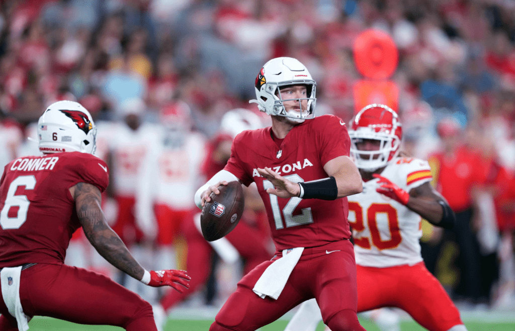
The latest redesign tried to modernize the look, but it ended up feeling like a knockoff version of a college team. It’s slick but soulless.
12. Jacksonville Jaguars
![Jacksonville Jaguars wide receiver Justin Blackmon (14) is shoved out of bounds in the first quarter against the Cincinnati Bengals at EverBank Field in Jacksonville, FL on Sunday, September 30, 2012. [Bob Self/Florida Times-Union] Spt 02bsjagsvsbengal](https://thequickreport.com/wp-content/uploads/2025/06/Untitled-design-2025-06-02T210216.978-1024x658.png)
They’ve been through multiple makeovers, but none have truly stuck. It’s a mix of teal, black, and indecision.
11. Washington Commanders
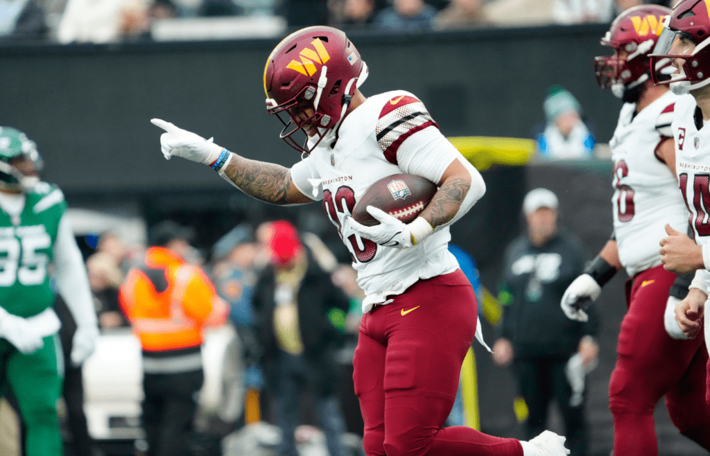
The rebrand was supposed to be a fresh start, but the uniforms feel more like placeholder templates than actual finished products. It’s all just a bit too generic.
10. Tennessee Titans
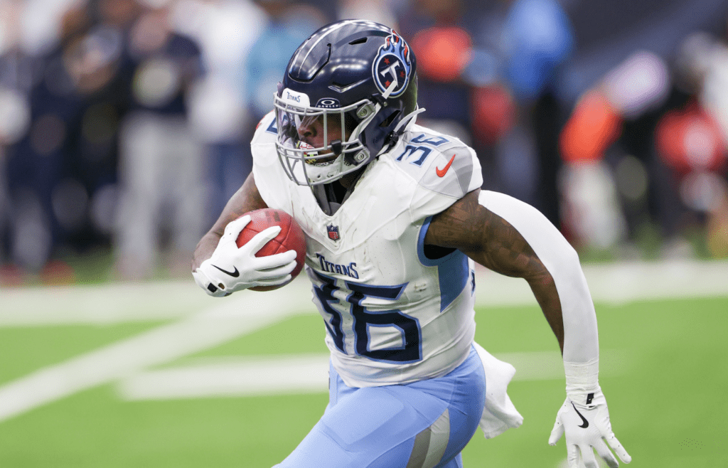
They have a unique color palette to work with, but the design feels overly aggressive and awkward. The helmet-sword logo combo is doing a little too much.
9. Atlanta Falcons
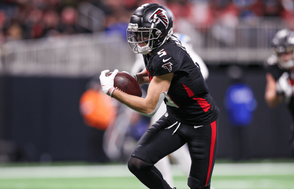
The gradient jersey should’ve stayed in the Photoshop draft folder. It feels like an unnecessary update to a look that didn’t need fixing.
8. Houston Texans
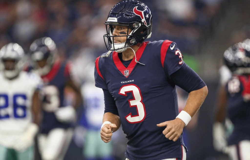
They’ve been wearing the same safe, forgettable uniforms since the early 2000s. It’s not that they’re offensive, they’re just terminally boring.
7. Los Angeles Rams
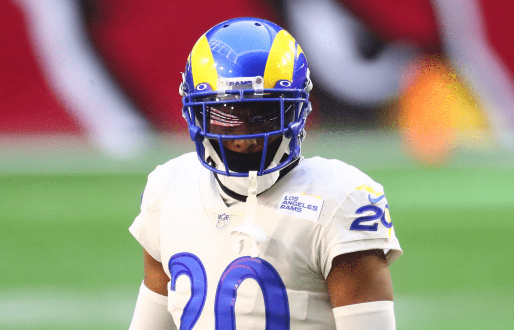
They had a golden opportunity with their move to LA, but the new uniforms feel more like arena league cosplay. The bone-white color? Still weird.
6. New York Jets
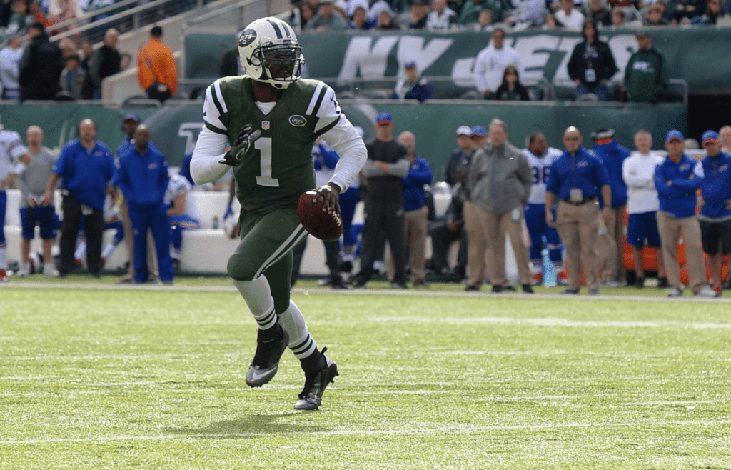
The all-black uniforms feel like a last-minute fashion decision for a team still figuring out its identity. The “Gotham Green” hype has never really landed.
5. Seattle Seahawks
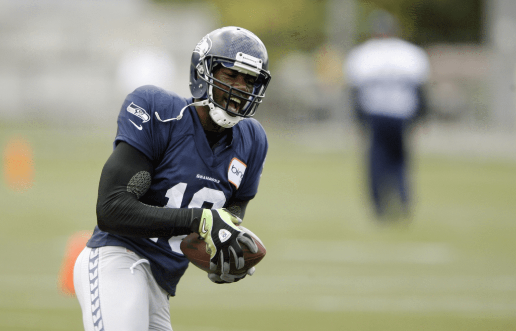
They’ve leaned hard into neon, and it’s not exactly aging well. It’s like they wanted to look like the future, but instead landed in a Mountain Dew commercial.
4. Tampa Bay Buccaneers (Alarm Clock Era)
They’ve since moved on, but those digital-number jerseys will never be forgotten. They looked like a glitch on your Madden screen.
3. Cincinnati Bengals (Old Set)
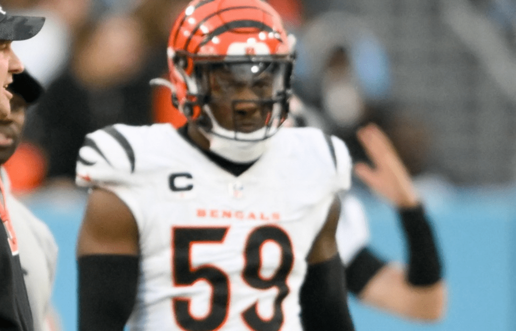
The new set is much better, but the previous ones looked like a Halloween costume you’d find at a discount store. The side stripes felt like they were trying way too hard.
2. Denver Broncos
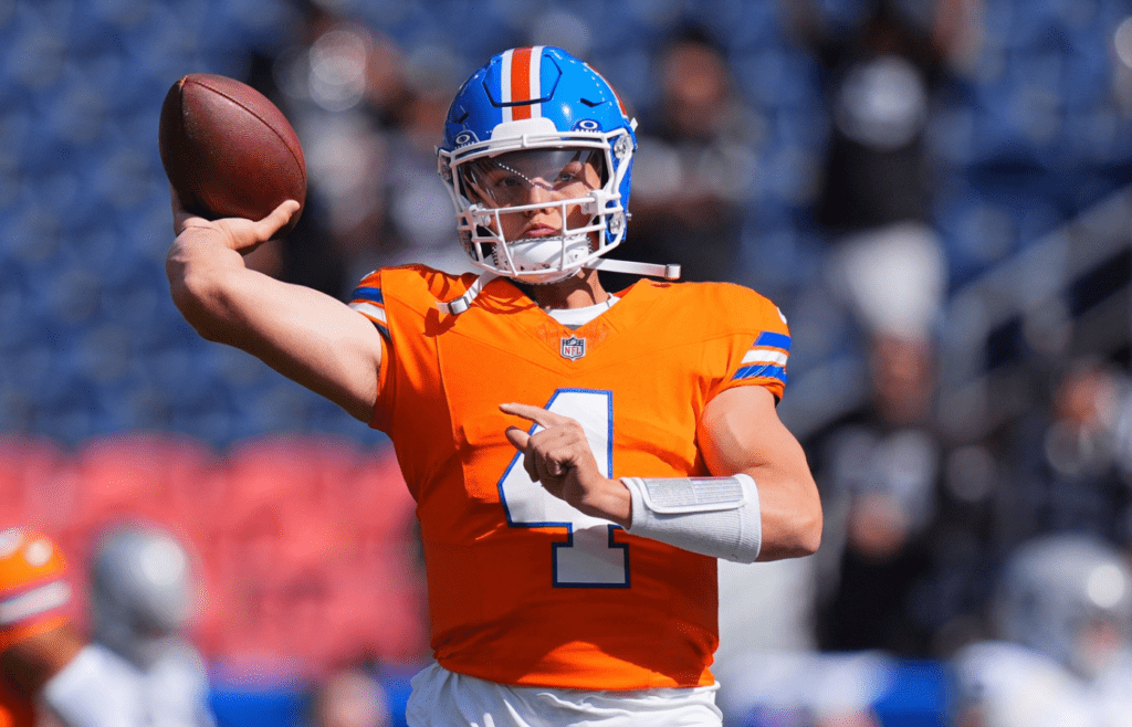
The uniform hasn’t changed since the late ’90s, and it really shows. The design screams “flip phone era” and not in a nostalgic way.
Read More: The 15 Most Ridiculous Athlete Fines of All Time
1. Carolina Panthers
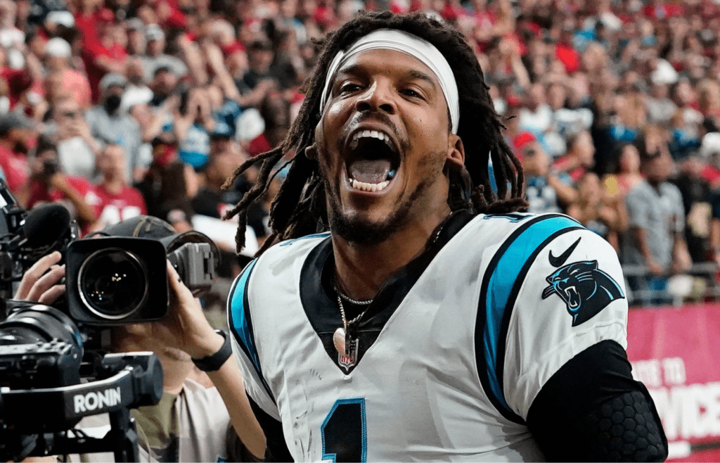
The color scheme has potential, but the design is stuck in the past. It’s one of the last remaining relics of the early 2000s, and not in a fun throwback kind of way.
Read More: Ranking All 32 NFL Uniforms From Worst to Best