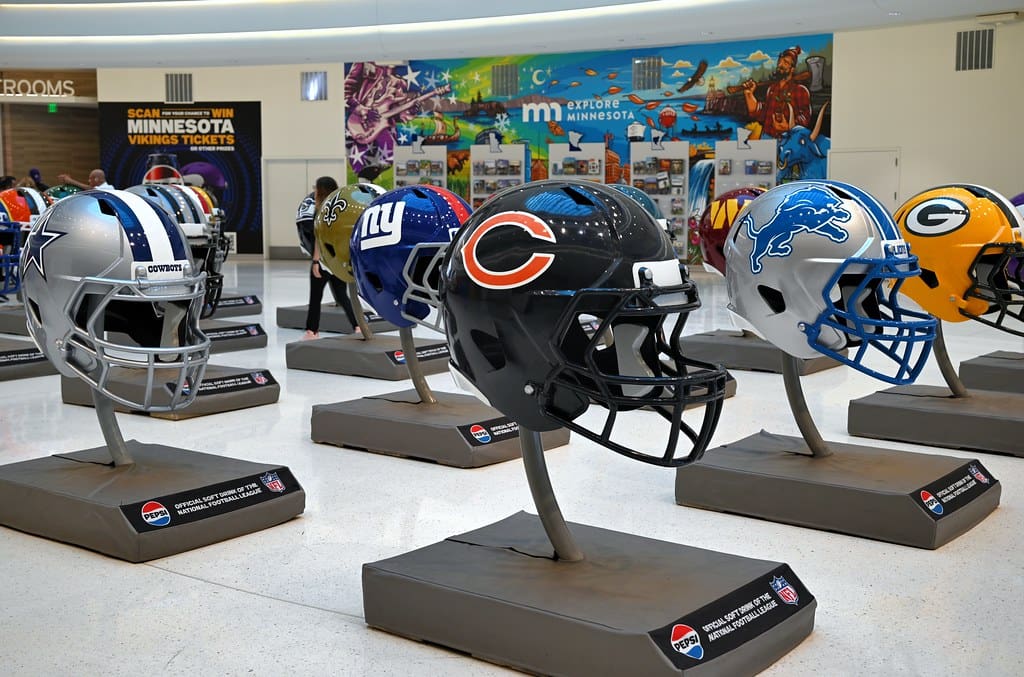
NFL logos are more than just emblems; they embody the history, identity, and spirit of each franchise. These designs serve as powerful symbols that connect teams with their fans, representing decades of tradition, triumphs, and evolution. Whether rooted in classic heritage or reflecting a bold, modern approach, each logo carries a unique story.
From iconic, time-honored designs to fresh, innovative rebrands, NFL logos vary widely in style and impact. Some have stood the test of time, while others have undergone major transformations. With that in mind, we’ve ranked all 32 NFL logos from worst to best—let’s see how they stack up!
32. Washington Commanders
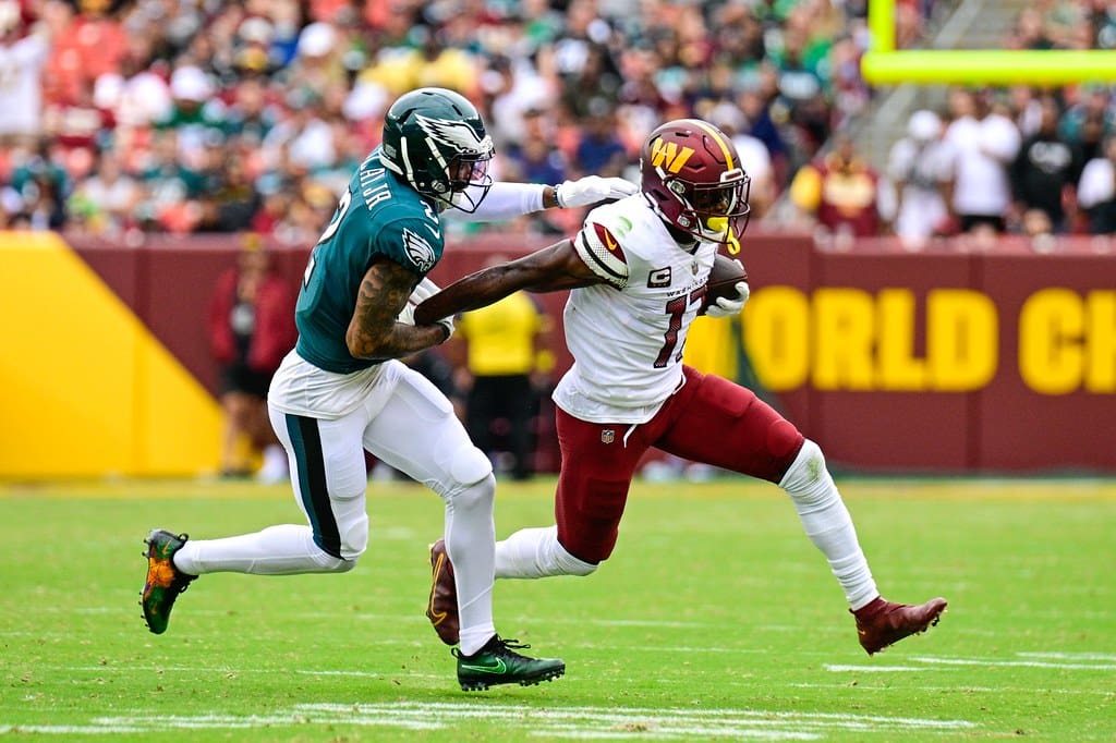
The Commanders’ logo is serviceable but generic. It doesn’t capture the spirit or energy of the franchise, probably due to the fact the name is so new.
31. Cleveland Browns
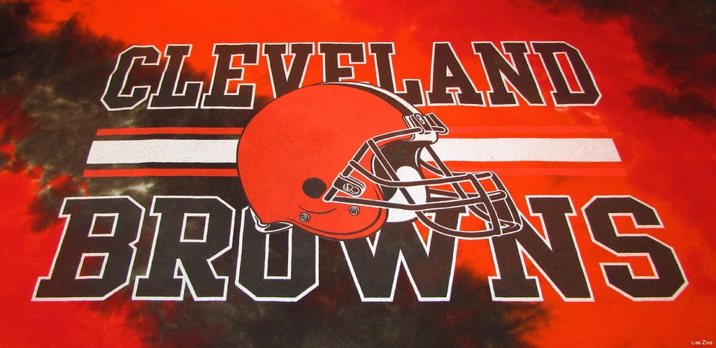
The Cleveland Browns’ logo is… a helmet. While the simplicity is iconic to show, it’s sort of uninspiring compared to the rest of the league.
30. Indianapolis Colts
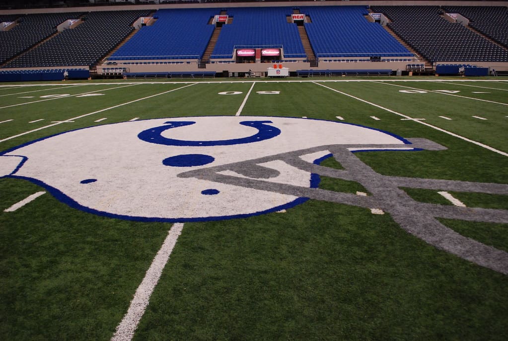
The horseshoe design is clean but, to be honest, it’s overly simple. Despite the franchise’s history, it just feels underwhelming.
29. New York Jets

While the Jets’ green football icon is a classic, it’s not particularly exciting. In fact, a more aggressive design could better reflect the team’s name and city.
28. Tennessee Titans
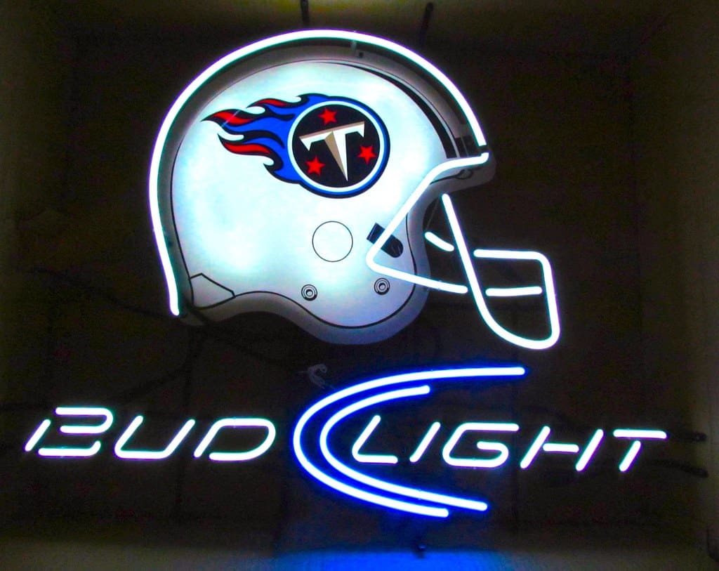
The Titans’ flame logo has potential, but its execution feels dated. Truthfully, it feels like a high school mascot.
27. Houston Texans
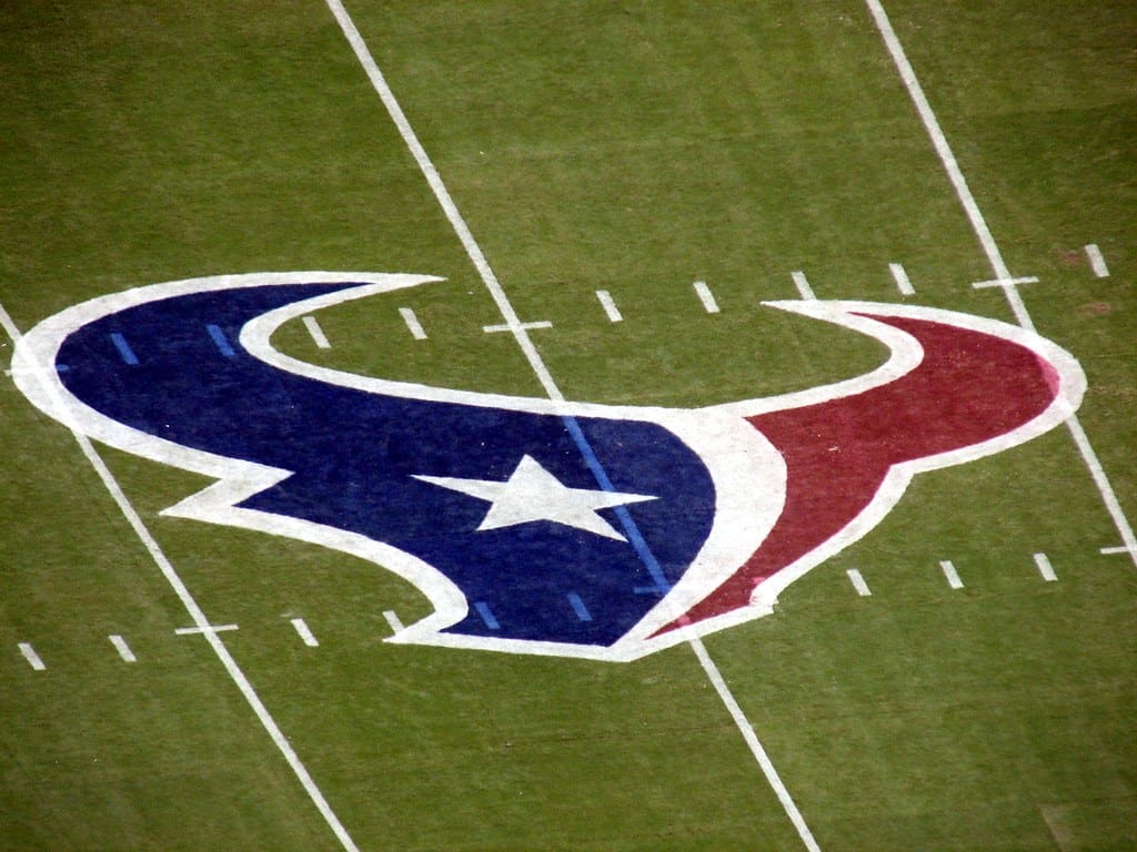
The Houston Texans’ bull logo is sleek, but it doesn’t stand out. A more distinctive approach might make it feel less corporate.
26. New England Patriots
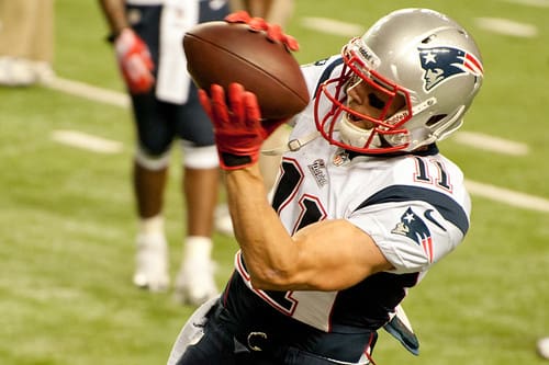
The “Flying Elvis” logo has been around for decades, and while it’s recognizable, it feels a bit stuck in the past. Sorry, Pats fans.
25. Detroit Lions
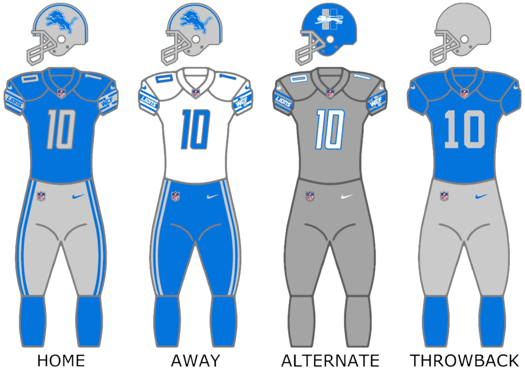
The lion silhouette is a strong concept, but the lack of detail makes it feel flat. A fiercer, more dynamic design could bring it to life.
24. Arizona Cardinals
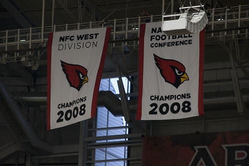
The Cardinals’ logo is clean and recognizable, but it lacks creativity. An update that emphasizes the bird’s speed or intensity could modernize the look.
23. Chicago Bears
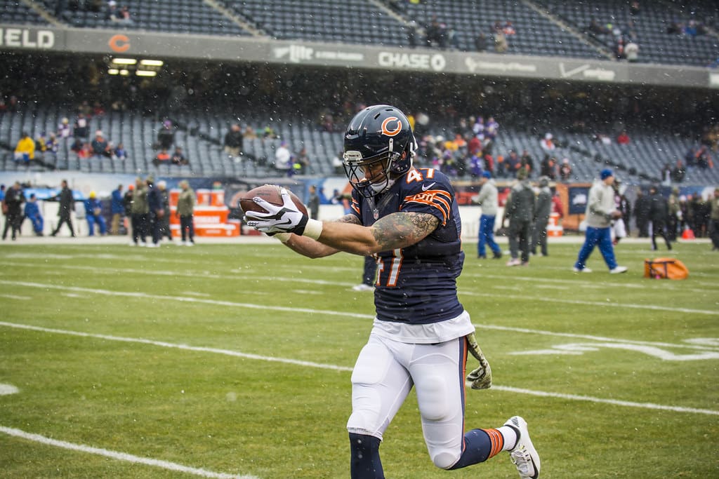
The iconic “C” logo is simple and classic, but it doesn’t evoke much emotion. Again, it’s another one of those logos that is cool for the hometown fans, but no one else in the league.
22. Miami Dolphins
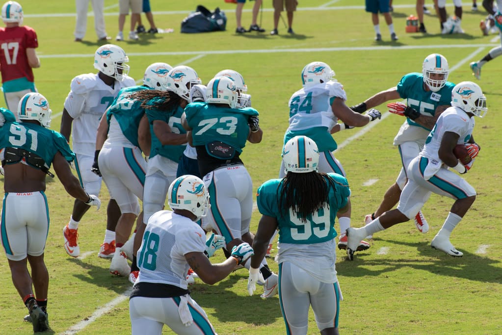
The leaping dolphin and sunburst are colorful and unique, but they lack toughness and aggression. But hey, that may have been what they wanted!
21. Carolina Panthers
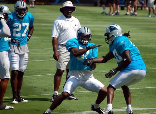
The Panthers’ logo is sleek and dynamic, but it’s starting to feel dated. A more modern take on the panther could elevate their branding.
20. Buffalo Bills
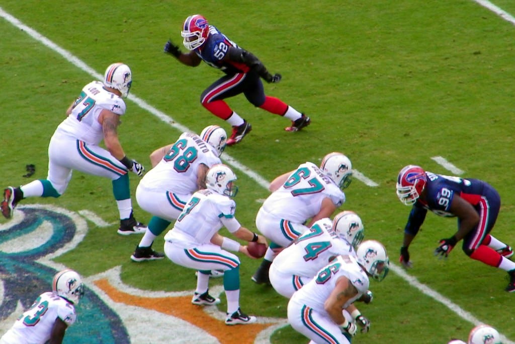
The Charging Buffalo logo is bold but doesn’t feel particularly creative. Simply put, it’s solid, but it’s not incredible..
19. Green Bay Packers
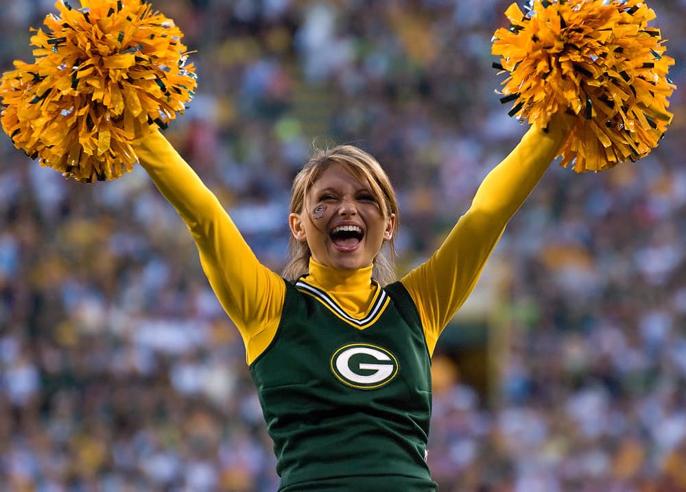
The “G” logo is iconic, but its simplicity might not resonate with non-Packers fans. The historical significance keeps it higher on the list, though.
18. Minnesota Vikings
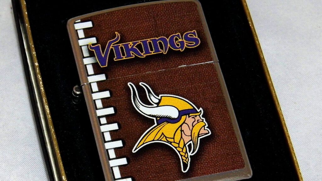
The Viking head is distinctive and memorable, but its cartoonish feel holds it back ever so slightly. A sharper, more intimidating version could take it to the next level.
17. Los Angeles Chargers
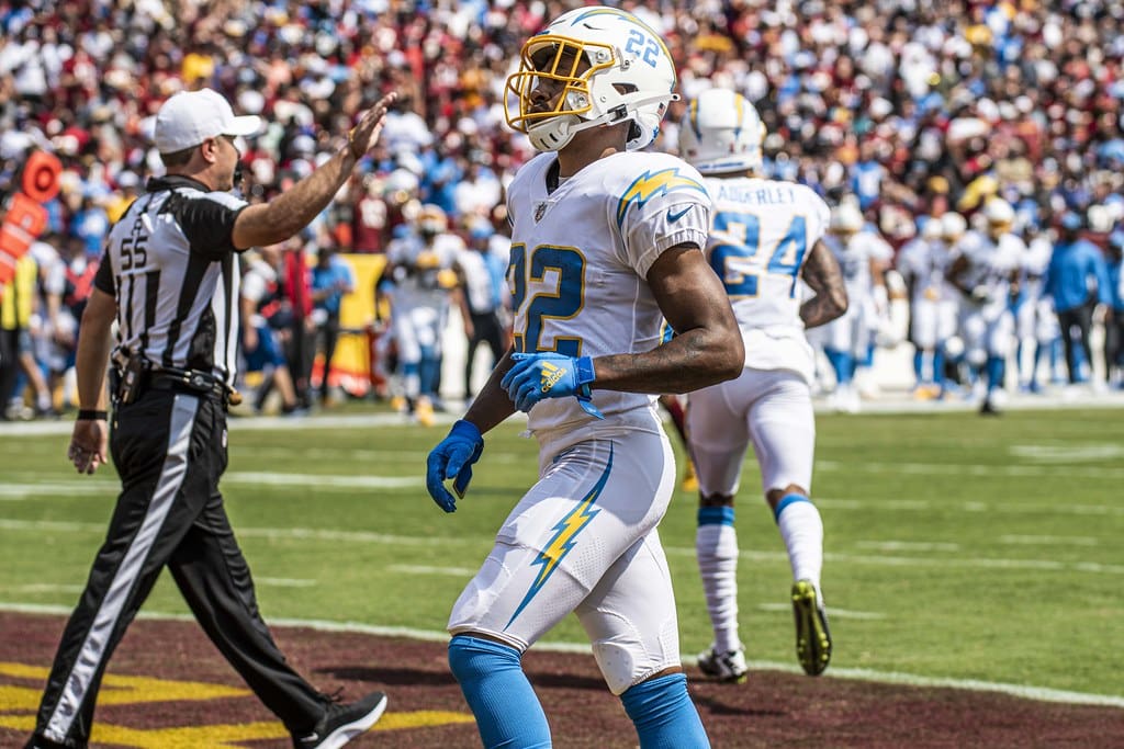
The lightning bolt is clean and modern, but it doesn’t immediately scream “Chargers.” Adding more detail or depth could enhance the design.
16. Seattle Seahawks
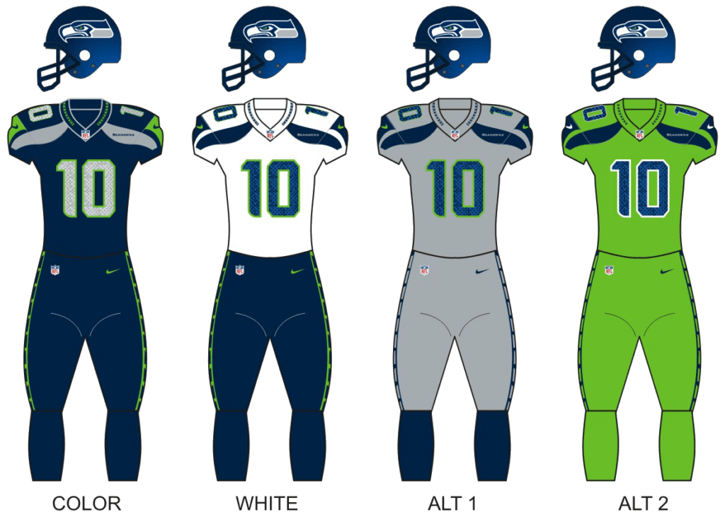
The Seahawks’ logo is sleek and aggressive, with cultural influences that make it stand out. However, it could benefit from a bolder color scheme.
15. Atlanta Falcons
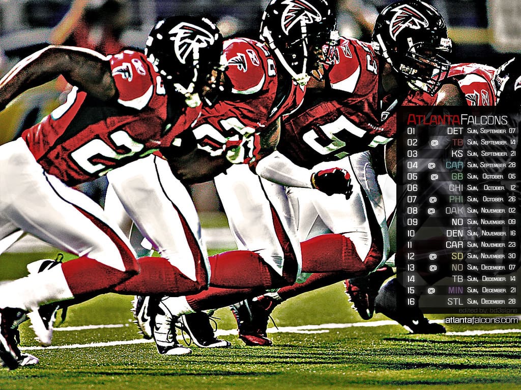
The falcon-shaped “F” is creative and dynamic. It’s a solid design, but it could use more detail to make it truly outstanding.
14. New York Giants
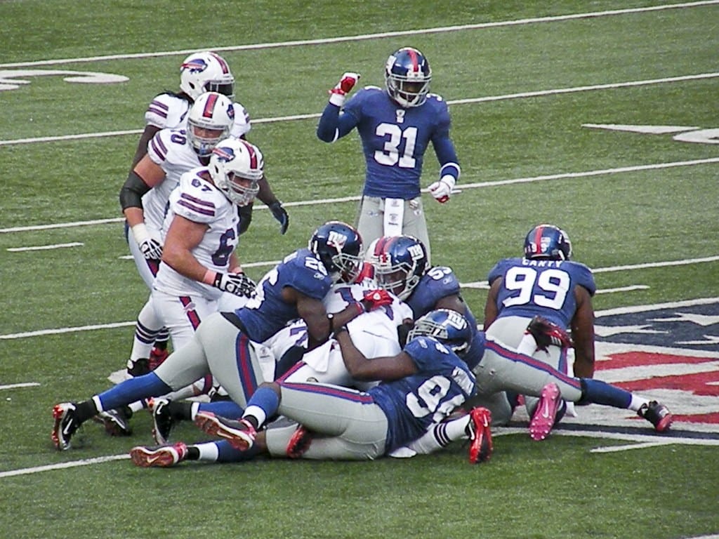
The “NY” logo is understated but effective. Its classic look works well, but it lacks the creativity seen in other top-tier logos.
13. Kansas City Chiefs
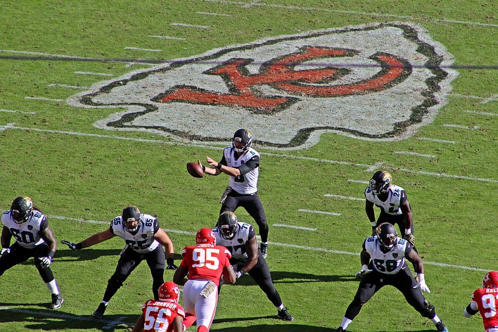
The arrowhead with the interlocking “KC” is distinctive and iconic, but the design could use a minor refresh to stay contemporary.
12. Jacksonville Jaguars
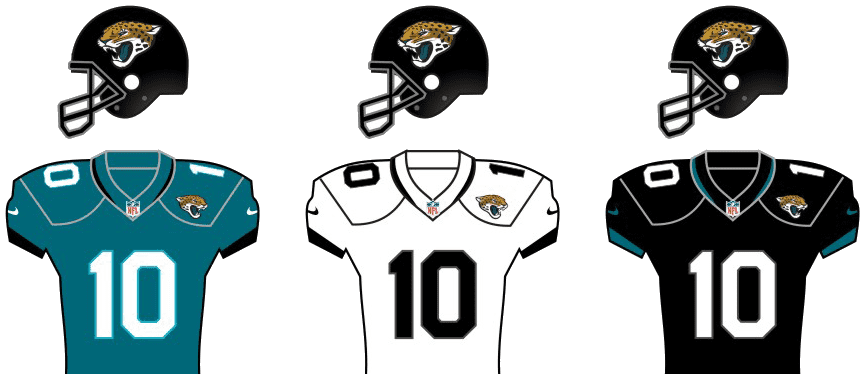
The jaguar head is fierce and well-detailed. It’s one of the better modern logos, though the color palette could be tweaked for a little more impact.
11. Baltimore Ravens
The raven head is unique and intimidating, with a gothic flair that fits the team’s identity. A slightly cleaner design could push it into the top 10.
10. Tampa Bay Buccaneers
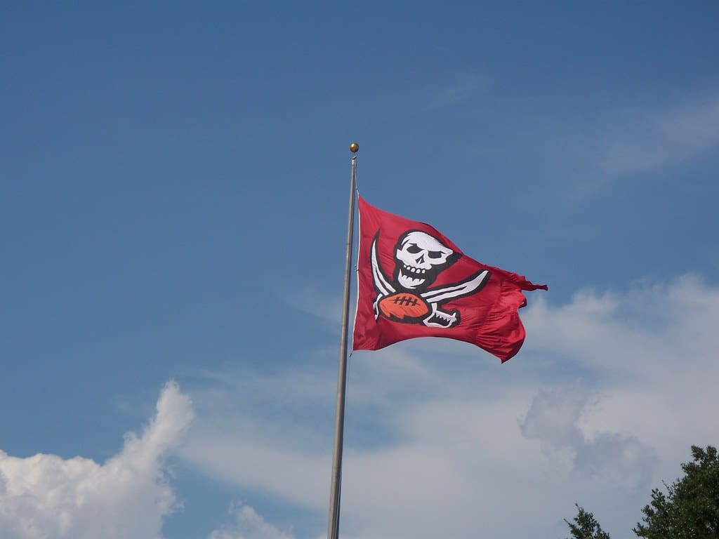
When you see this logo, you know the team instantly. The pirate flag logo is bold, creative, and perfectly fits the team’s swashbuckling identity.
9. Las Vegas Raiders
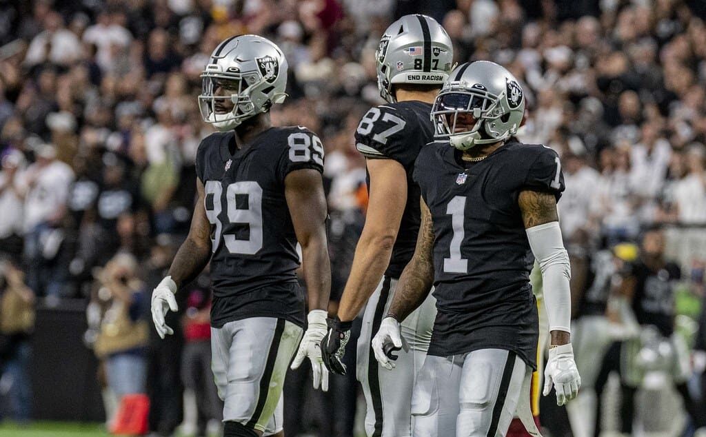
The Raiders’ pirate logo is bold, timeless, and embodies the team’s rebellious identity.
8. Denver Broncos
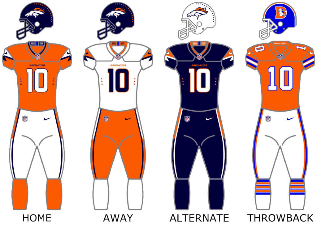
The charging bronco symbolizes speed and power. Its clean, modern design is solid, but it lacks the historical gravitas of the higher-ranked logos.
7. Los Angeles Rams
The Rams logo is very clean and modern but with a unique twist. The way the ram’s horn doubles as an “L” is such a clever design move.
6. Cincinnati Bengals
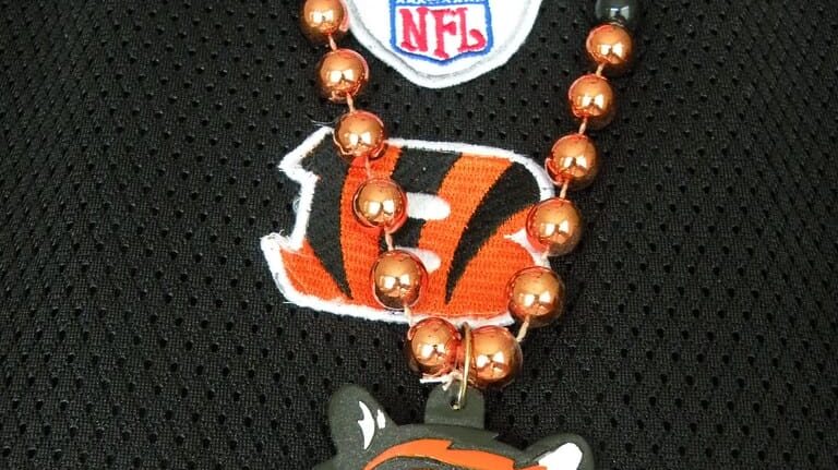
The striped “B” is sleek, modern, and instantly recognizable, making it a top-tier design. It’s simple but also has enough flair to make it fun.
5. San Francisco 49ers
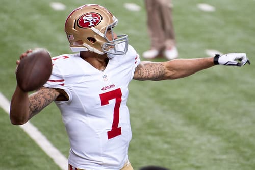
The interlocking “SF” is classic and instantly recognizable. Its longevity and simplicity make it a standout.
Read More: 10 Worst NBA Franchises of the 2000s
4. Philadelphia Eagles
The eagle head is sharp, aggressive, and iconic. Not to mention, the hidden “E” in the feathers adds a clever touch.
Read More: 10 Ways Vintage Tech Beats Out the Modern Versions
3. New Orleans Saints
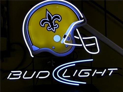
The fleur-de-lis is elegant and distinctive, perfectly capturing the spirit of New Orleans. It’s an iconic symbol that has distinct ties to the city, which makes it extra special.
Read More: The Worst NFL Franchises of the ’80s
2. Pittsburgh Steelers
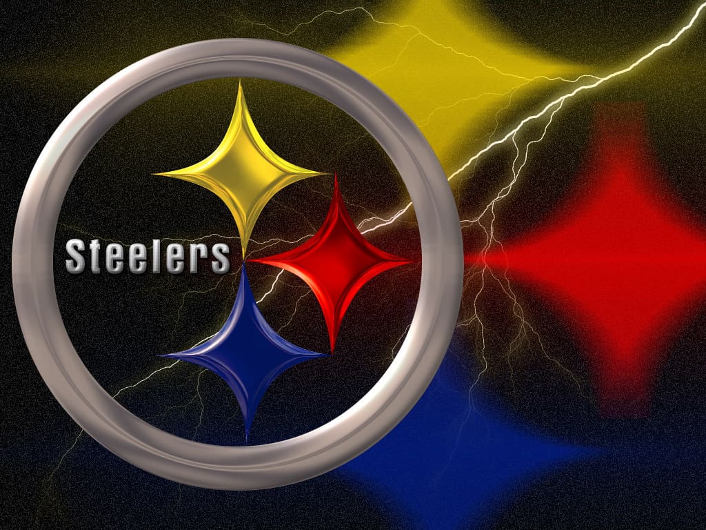
The Steelmark logo is steeped in history and represents the city’s industrial roots. Its simplicity is timeless.
Read More: All 32 NFL Starting Quarterbacks Ranked From Worst to Best
1. Dallas Cowboys
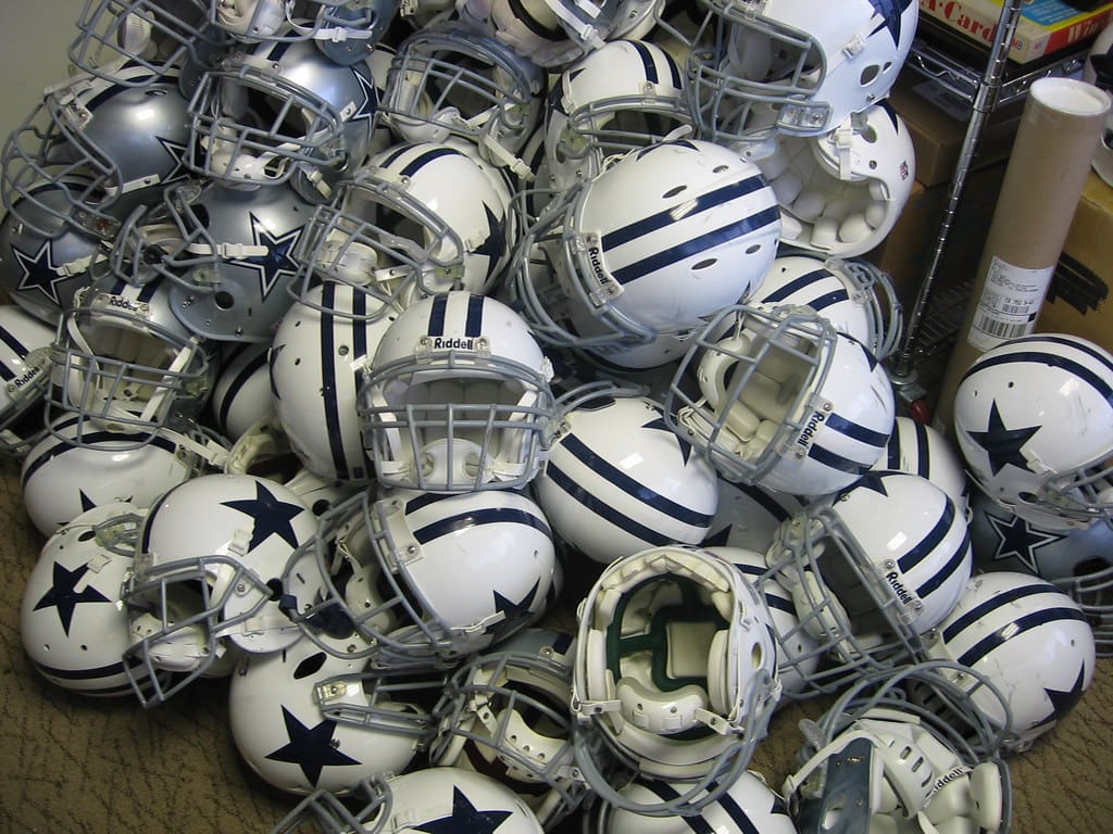
The lone star is one of the most iconic symbols in sports. Its simplicity and association with Texas culture keep it among the best.
Read More: The 10 Worst NFL Franchises of the 2000s

