The NBA is home to some of the most iconic branding in sports, but while some logos perfectly capture the essence of their teams, others fall short. Here’s a ranking of all 30 NBA logos from worst to best.
30. Los Angeles Clippers
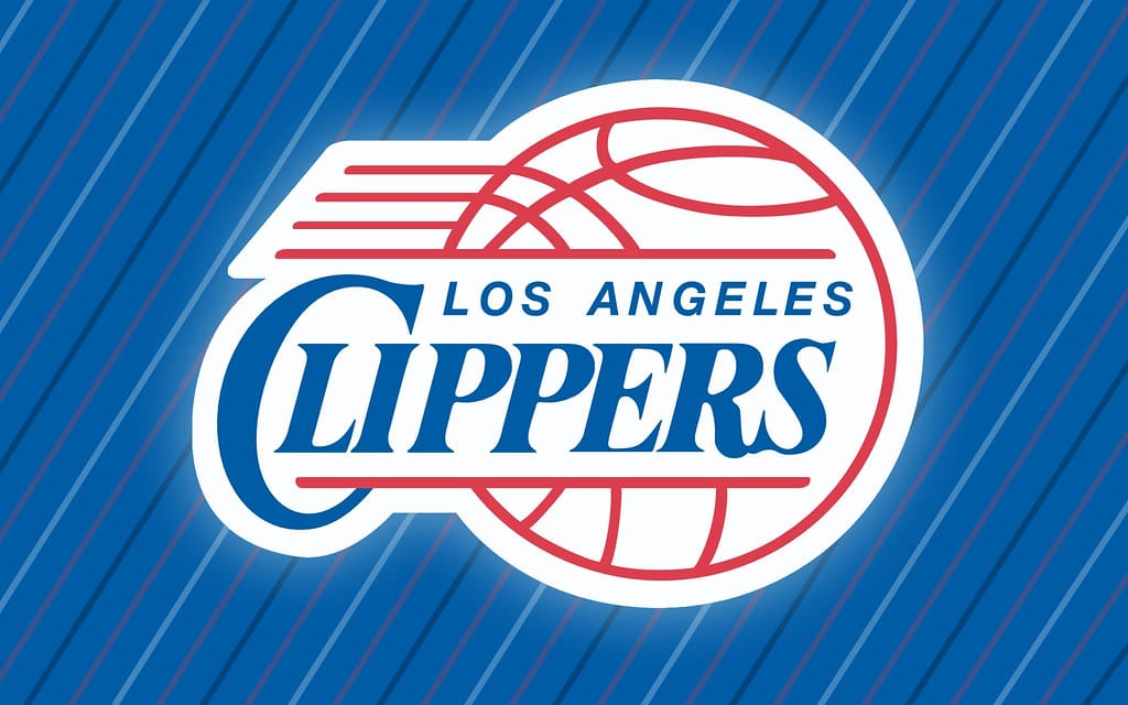
Sorry to Los Angeles Clippers fans, but the team’s logo is not great. The font is generic and it lacks any sense of the team’s identity.
29. Washington Wizards
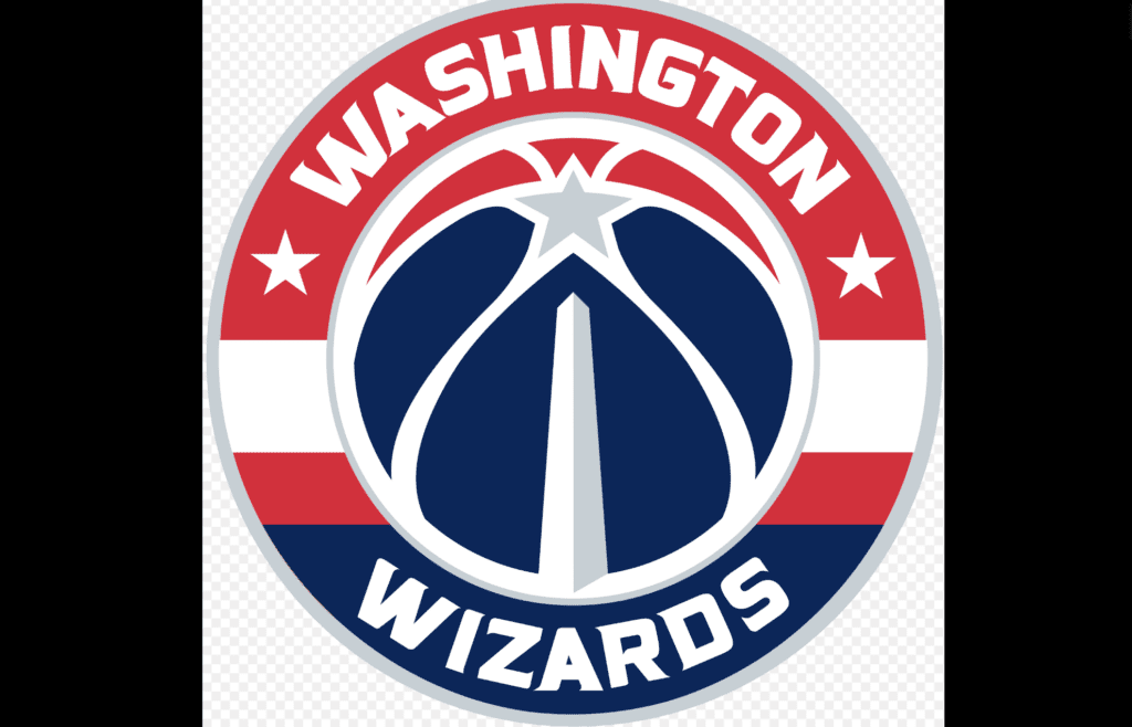
While the Wizards’ updated logo embraces the red, white, and blue color scheme to reflect the nation’s capital, it’s a bit too busy. Not to mention, the wizard imagery has been completely lost. What’s the point of being named the “Wizards” if you don’t include it in your logo?!
28. Sacramento Kings
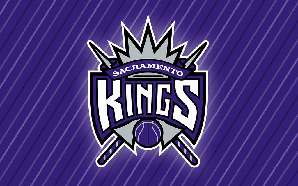
The Sacramento Kings’ logo has improved over the years, but its sharp, geometric design feels a bit too corporate if we’re being honest. And, while the crown nods to royalty, the overall execution lacks flair.
27. Detroit Pistons
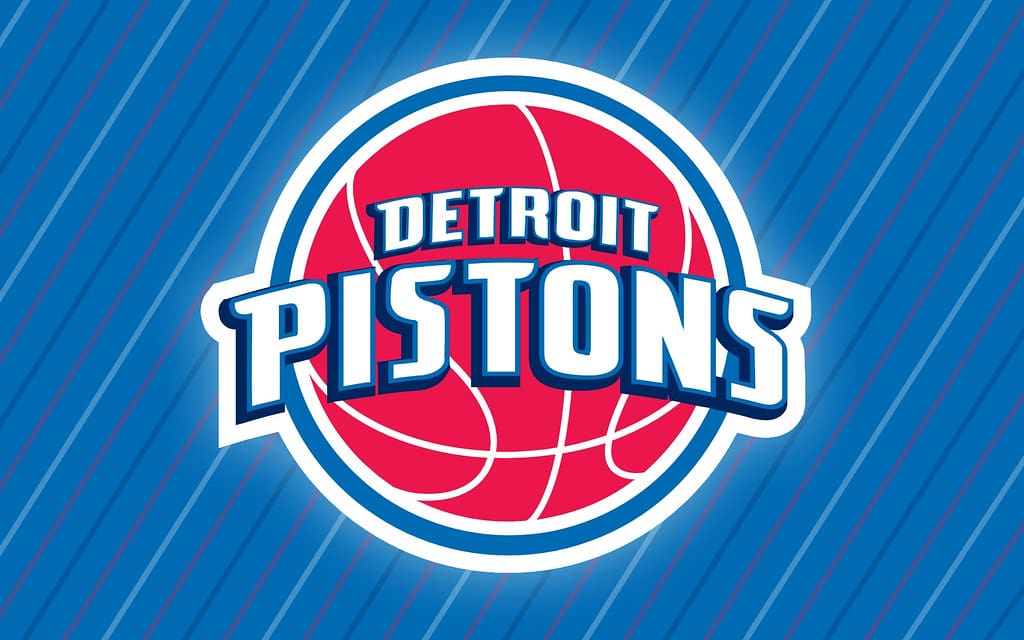
The Detroit Pistons logo isn’t bad, per se, but it also doesn’t stand out either. Its retro feel is a nod to tradition, but it struggles to make any sort of connection to Detroit’s blue-collar identity.
26. New Orleans Pelicans
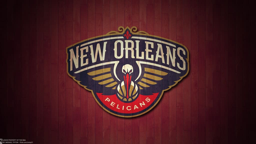
The New Orleans Pelicans logo feels cluttered and overly detailed. Not to mention, the colors just do not look good together. In fact, the overall design feels more like a tourism badge than a sports logo. Sorry, not sorry!
25. Orlando Magic
The Magic’s logo feels stuck in the 1990s. While the shooting star motif fits the team’s name, it doesn’t feel modern or dynamic enough compared to other logos in the league.
24. Cleveland Cavaliers
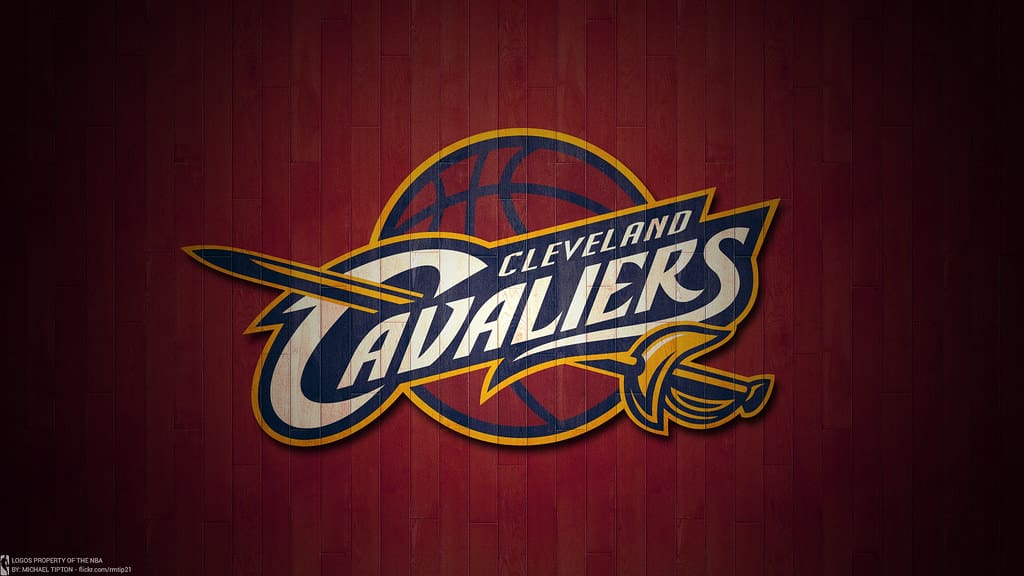
The Cavaliers’ current logo leans heavily into their wine-and-gold color scheme, but the sword motif feels underutilized. It’s fine, but it could be so much better.
23. Memphis Grizzlies

The Memphis Grizzlies’ logo features a bear that looks both intimidating and cartoonish. While it at least has personality, it lacks the sleekness seen in the league’s best designs.
22. Phoenix Suns
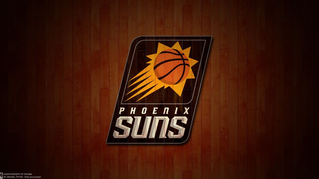
We appreciate that the Phoenix Suns’ logo is bright and vibrant, but the basketball-sun combo feels like a missed opportunity for a more dynamic, desert-themed design.
21. Indiana Pacers
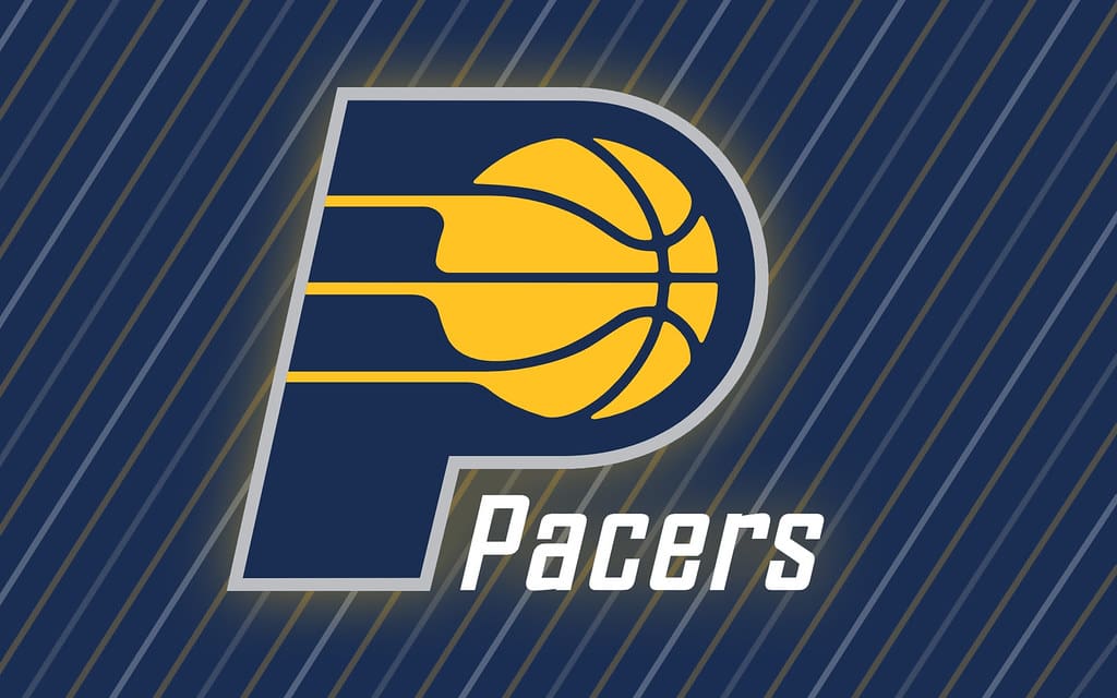
The Pacers’ logo is classic but plain. Which means it’s pretty boring. The basketball and “P” design have been consistent over the years, but it doesn’t really pack a punch.
20. Minnesota Timberwolves

The Timberwolves’ wolf-and-moon logo is visually striking, but the colors don’t necessarily pop. Again, it’s a perfectly fine logo, but it’s not doing anything special.
19. Denver Nuggets

The Nuggets’ pickaxe logo is an excellent nod to Denver’s mining history, but the color scheme and overall design could be more adventurous.
18. Charlotte Hornets
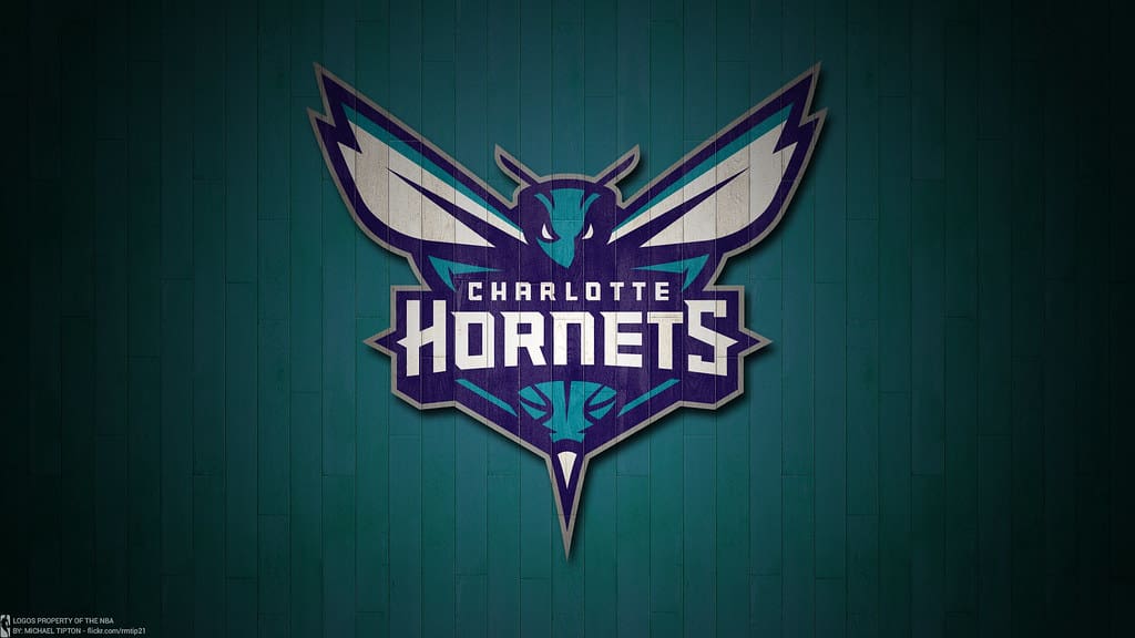
The Charlotte Hornets logo has a sleek design, bold lines, and lots of color. But, while it captures the team’s identity well, it could use a bit more personality to elevate it.
17. Atlanta Hawks
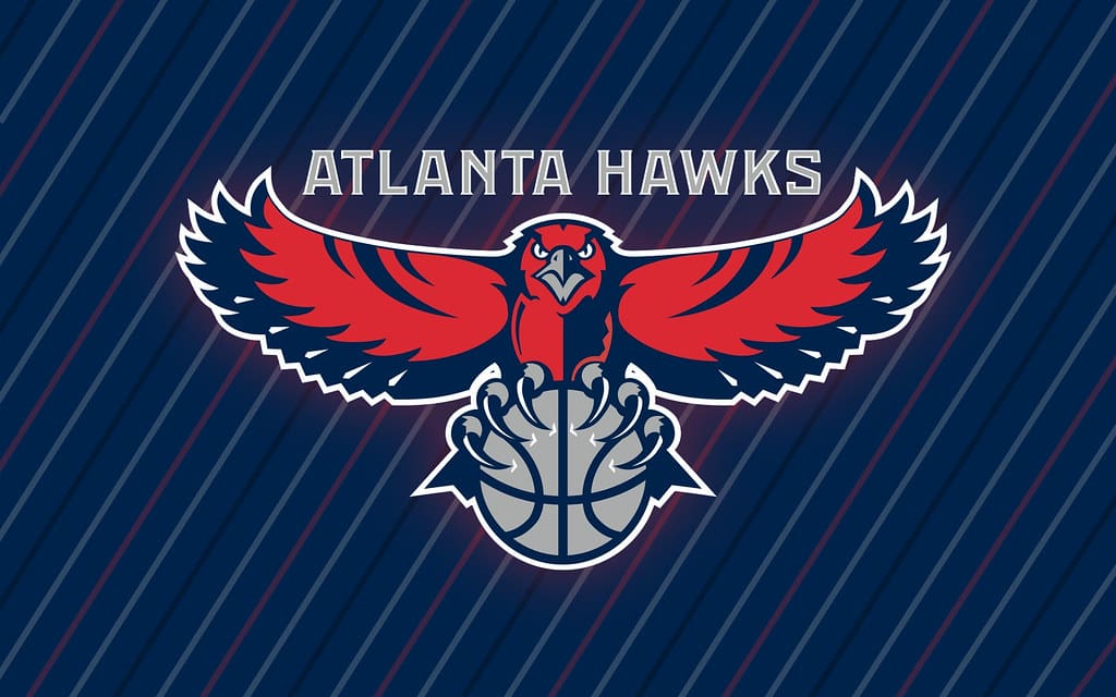
While we appreciate that the Atlanta Hawks logo is clean and modern, it is entirely lacking in the “wow factor.”
16. Houston Rockets
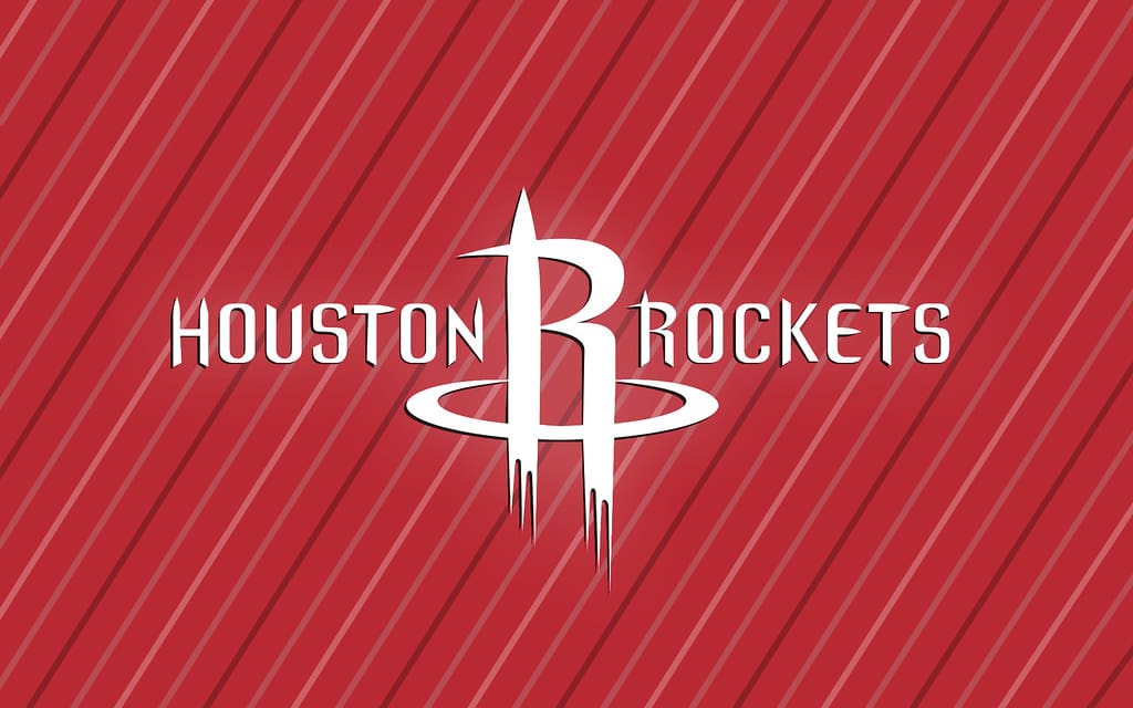
The Rockets’ logo incorporates the “R” as a rocket launching, which is clever, but the overall design feels a bit dated. In fact, the logo could use a refresh to match the team’s energy.
15. Milwaukee Bucks
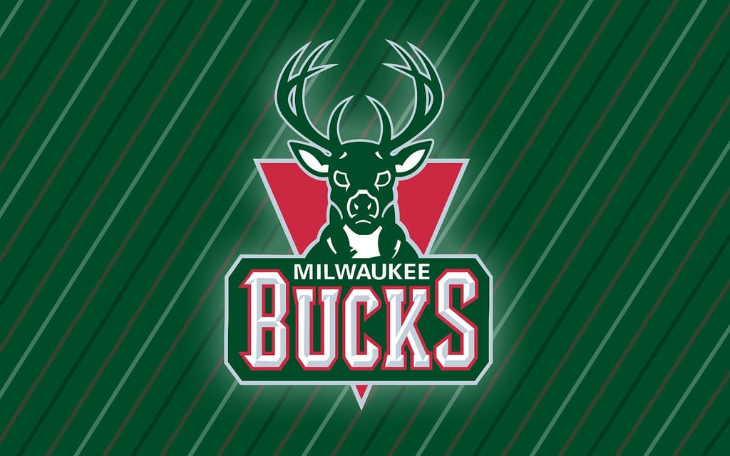
The Bucks’ logo features a strong, modern depiction of a buck, which checks all the boxes. But, while it’s a great design, it doesn’t quite stand out as much as some of the others.
14. Oklahoma City Thunder
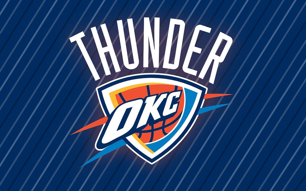
The Thunder’s logo has been criticized for being generic, but its unique color scheme and lightning bolt accents at least give it a bit of flair. However, it could use a redesign to better reflect the team’s identity.
13. Brooklyn Nets
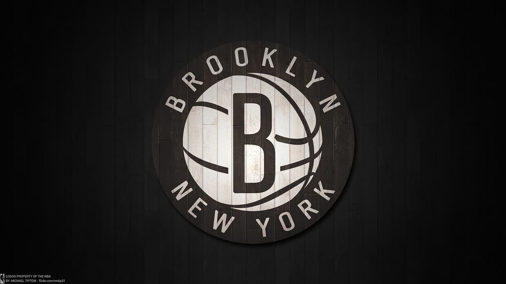
Some may say the Brooklyn Nets’ logo is basic, but the black-and-white design makes it feel very sleek. In fact, you can never really go wrong with simple black and white, right?!
12. San Antonio Spurs
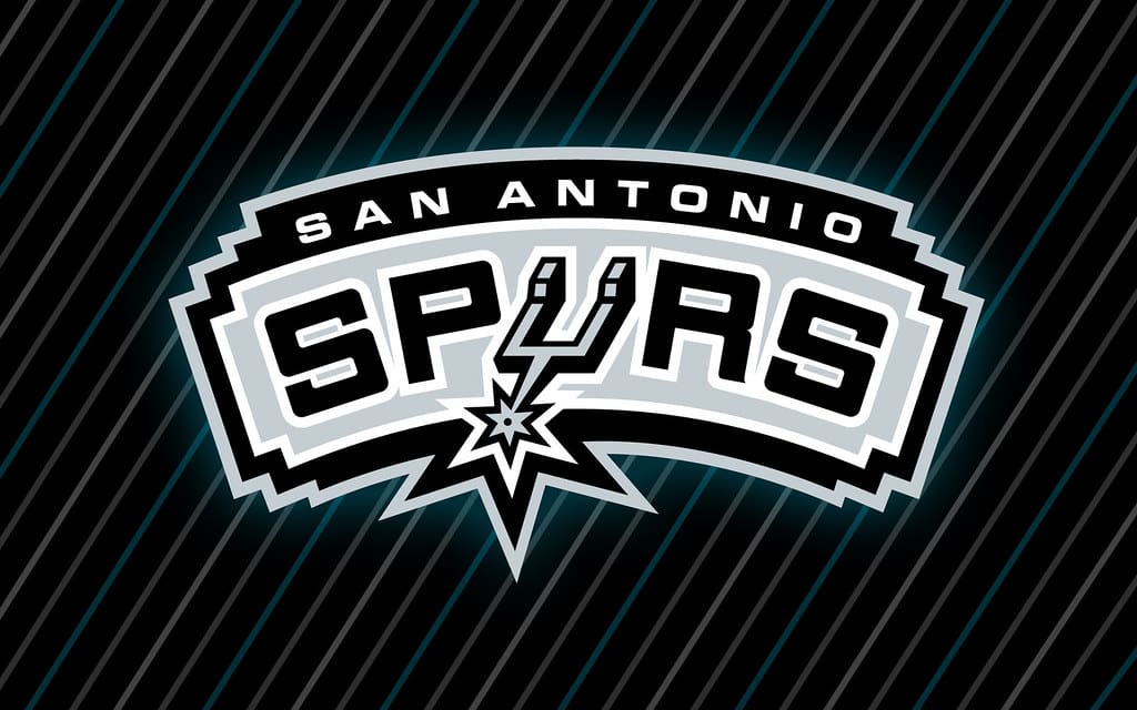
The Spurs’ logo cleverly incorporates the spur into the team name, and its simplicity works well. Simply put, it’s classic without being boring.
11. Philadelphia 76ers
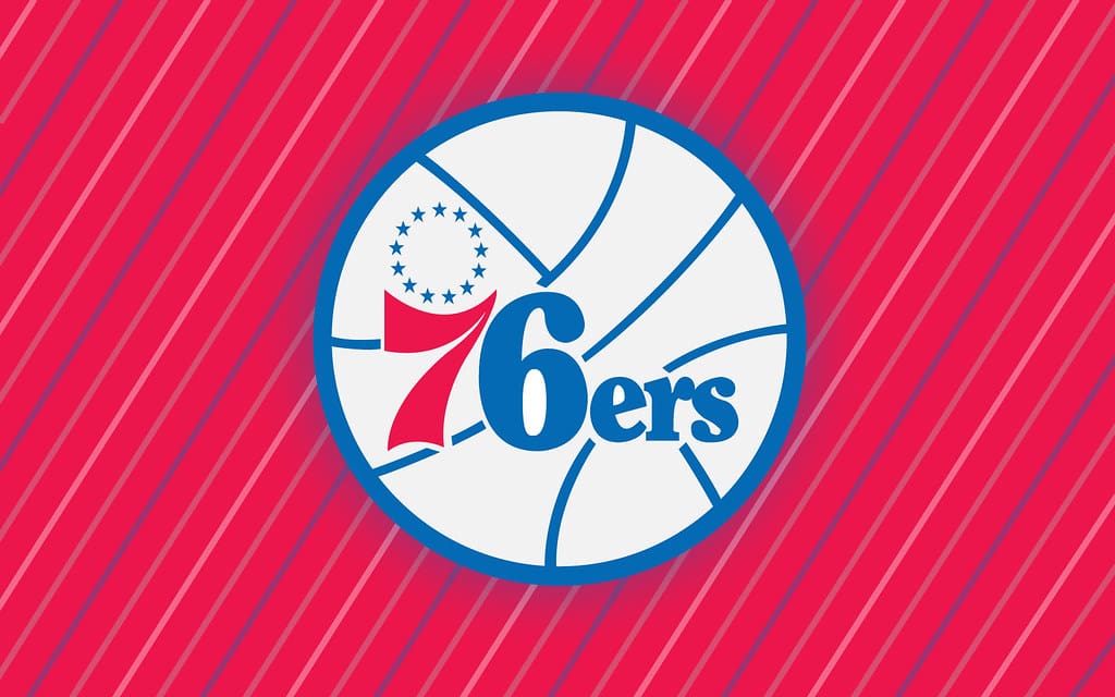
The 76ers’ logo pays homage to America’s founding, and its basketball imagery is clean and timeless. While it’s definitely not groundbreaking, it’s a solid representation of the team.
10. Boston Celtics
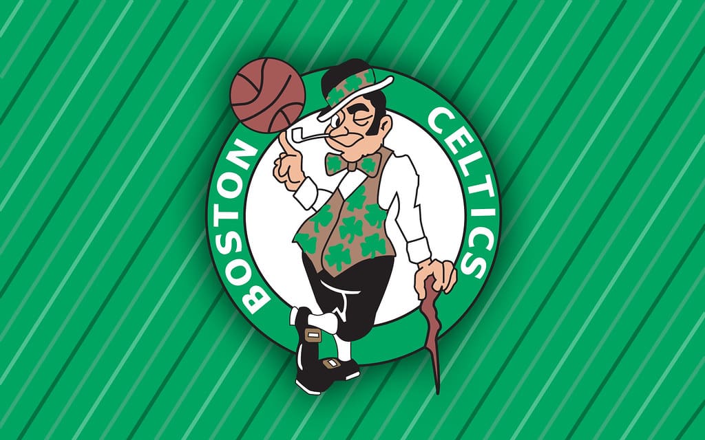
The Celtics’ leprechaun logo is iconic and full of personality, though it can feel a bit dated compared to modern designs. Its charm is undeniable, though. Who doesn’t like a leprechaun, right?!
9. Toronto Raptors
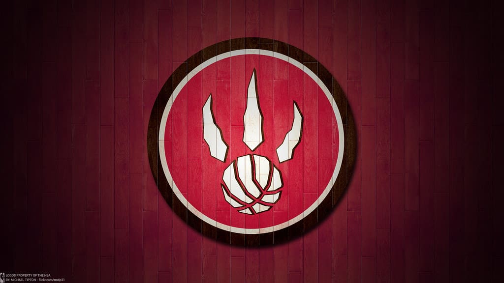
The Raptors’ logo is sleek and modern, featuring a claw mark on a basketball. It’s a clever design that isn’t too overly complicated.
8. Chicago Bulls
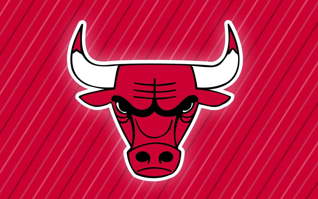
The Bulls’ logo is one of the most recognizable in sports, featuring a fierce bull with bold lines. Its timelessness — and the fact it’s so closely associated with Michael Jordan — cements it as one of the best.
7. Los Angeles Lakers
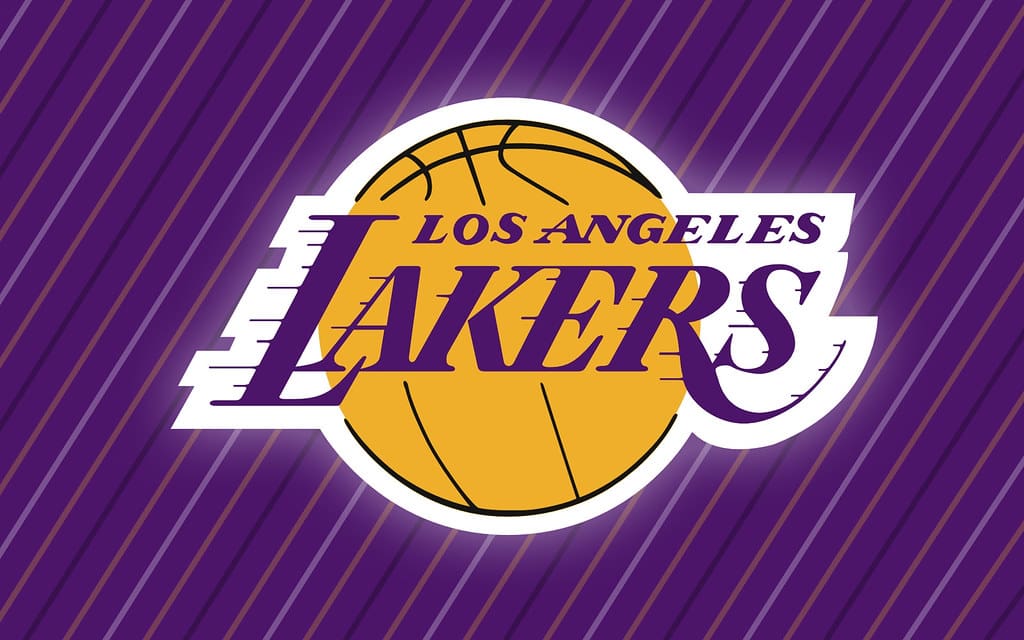
The Lakers’ logo is simple but iconic. It represents the team’s historic dominance, while the purple-and-gold color scheme stands out in a league filled with more subdued colors.
6. Miami Heat
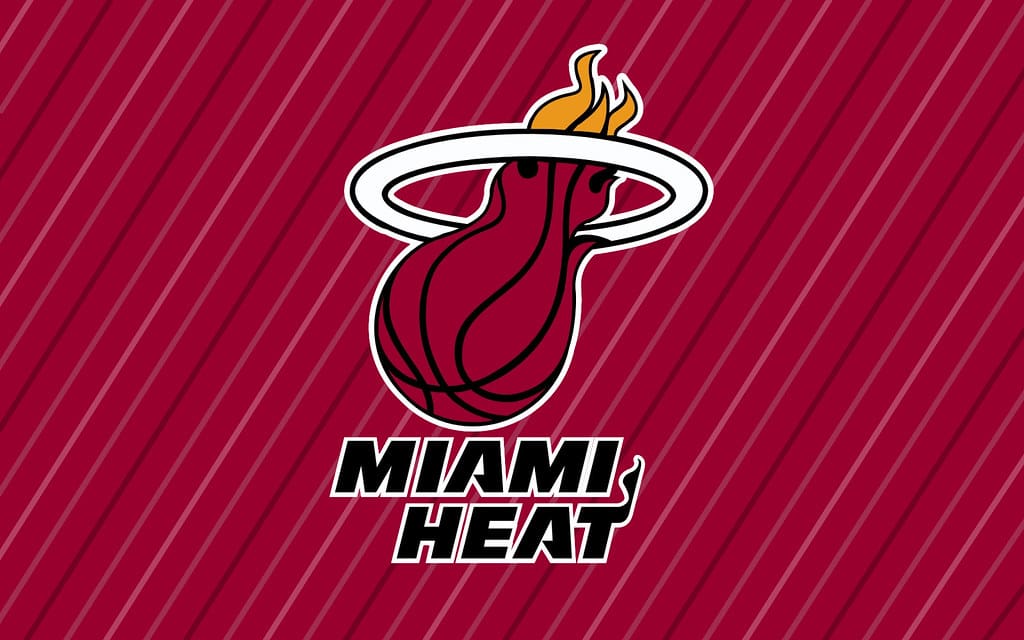
The Heat’s flaming basketball logo perfectly captures the team’s energy and style. It’s simple and classic, but it’s also dynamic and bold at the same time.
5. Dallas Mavericks
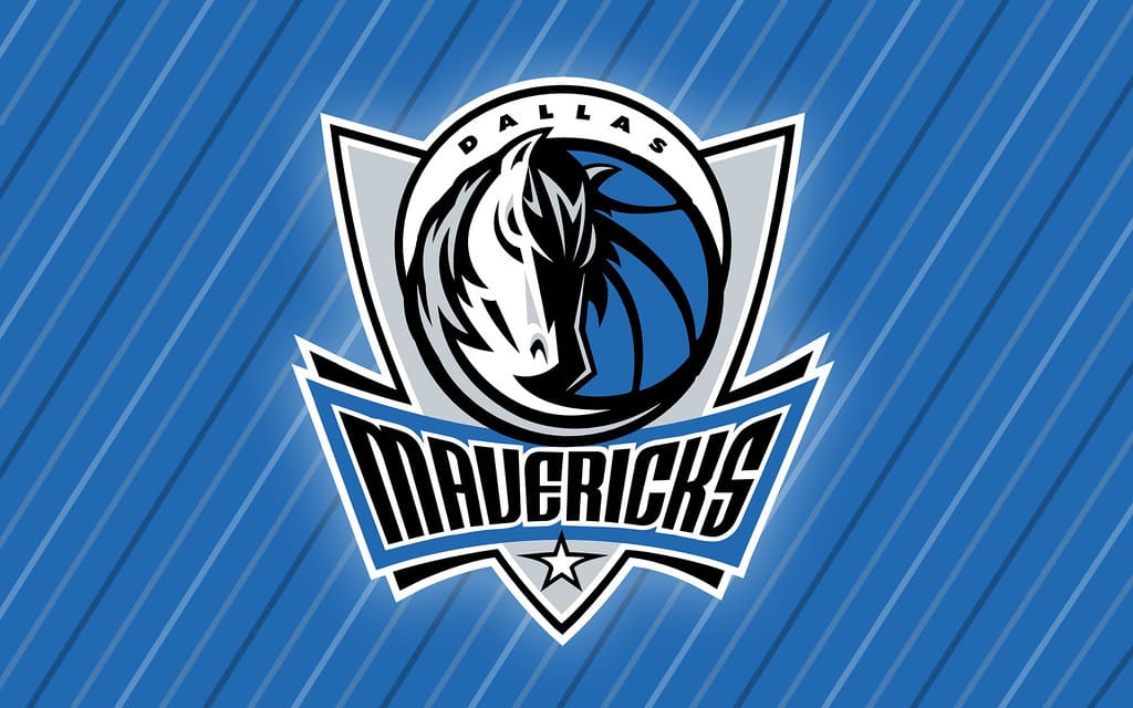
The Mavericks’ horse-and-basketball design is bold and unique, but it’s not overpowering. It perfectly reflects the team’s name, while also keeping it modern and fresh.
Read More: The 15 Most Successful NBA Coaches of All Time
4. Portland Trail Blazers

Simply put, the Trail Blazers’ abstract pinwheel logo is a masterclass in simplicity and creativity. In fact, it has to be one of the most unique logos in all of sports.
Read More: 10 Worst NBA Franchises of the ’90s
3. Golden State Warriors
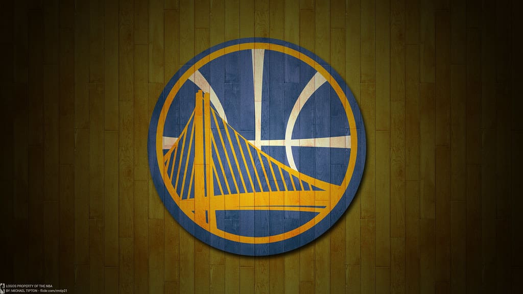
The Warriors’ bridge logo is both a nod to the Bay Area and a bold, clean design, which is not easy to do! Its simplicity and local pride make it a standout.
Read More: 10 Worst NBA Franchises of the 2000s
2. Utah Jazz
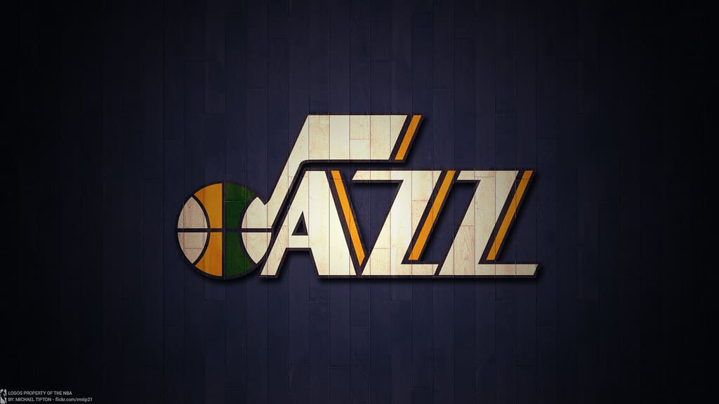
The Jazz’s music-themed logo has been revamped over the years, but its sleek and modern design perfectly balances tradition and innovation.
Read More: Ranking All 12 WNBA Logos From Worst to Best
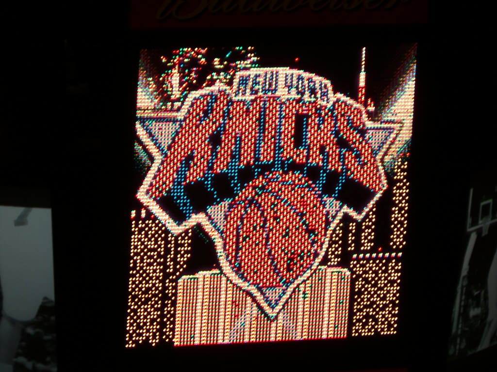
1. New York Knicks
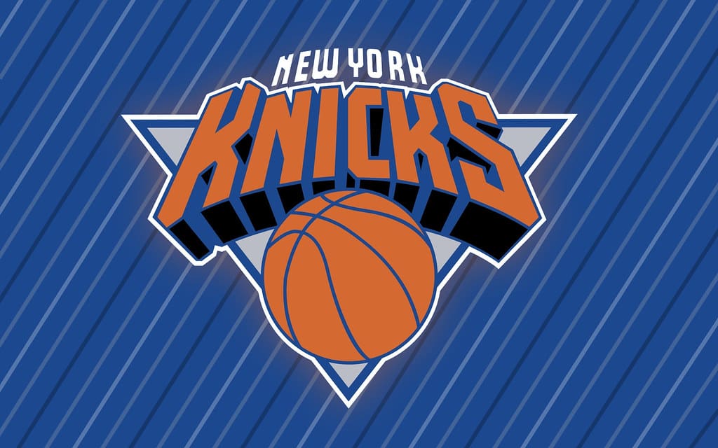
The Knicks’ logo has remained largely unchanged for decades, and its retro-modern design perfectly represents the team’s identity and the energy of New York City. The Knicks have certainly had their ups and downs in recent years, but there’s no question their logo is iconic.
Read More: Ranking All 32 NFL Logos From Worst to Best