The WNBA has grown into a league of excellence and empowerment, and its teams reflect that identity through their branding. Logos are a vital part of a franchise’s image, as they help to represent their city, culture, and competitive spirit. While some designs stand out as iconic and timeless, others could use a bit of a refresh. Here’s our ranking of all 12 current WNBA logos.
12. Indiana Fever
The Fever logo, while colorful, feels slightly dated. And, now that the team has Caitlin Clark and an incredible amount of momentum, it may be time for a refresh.
11. Phoenix Mercury
While the Mercury logo captures the fiery vibe of the team’s name, it’s not particularly interesting. The basketball streaking across the design is a nice touch, but the overall layout could benefit from a more streamlined approach.
10. Atlanta Dream
The Dream’s logo is a solid design, but it doesn’t quite stand out among the league’s top-tier logos. Frankly, it doesn’t really tell me anything about the team, nor does it reflect the “Dream” name.
9. Dallas Wings
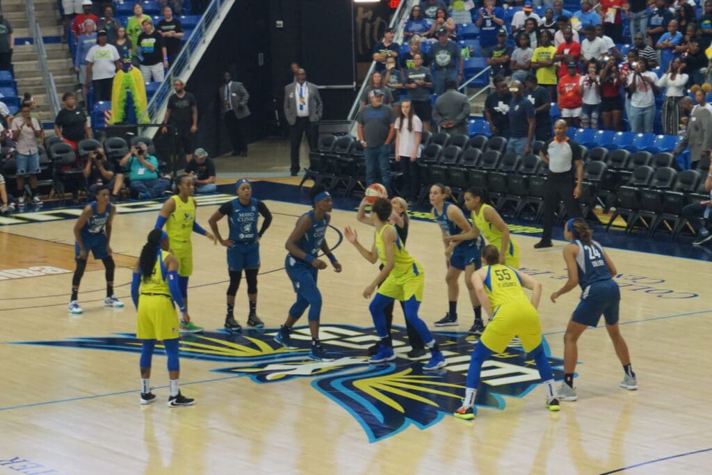
The Wings’ logo features bold colors and a winged basketball, but its sharp, angular design comes across as a bit harsh. And, while the blue and yellow color scheme is bright and energetic, the overall aesthetic lacks sophistication.
8. Los Angeles Sparks
The Sparks logo incorporates palm trees and a starburst to reflect sunny Los Angeles, but it feels somewhat cluttered. The color scheme is vibrant, but simplifying the design would probably make it better.
7. Washington Mystics
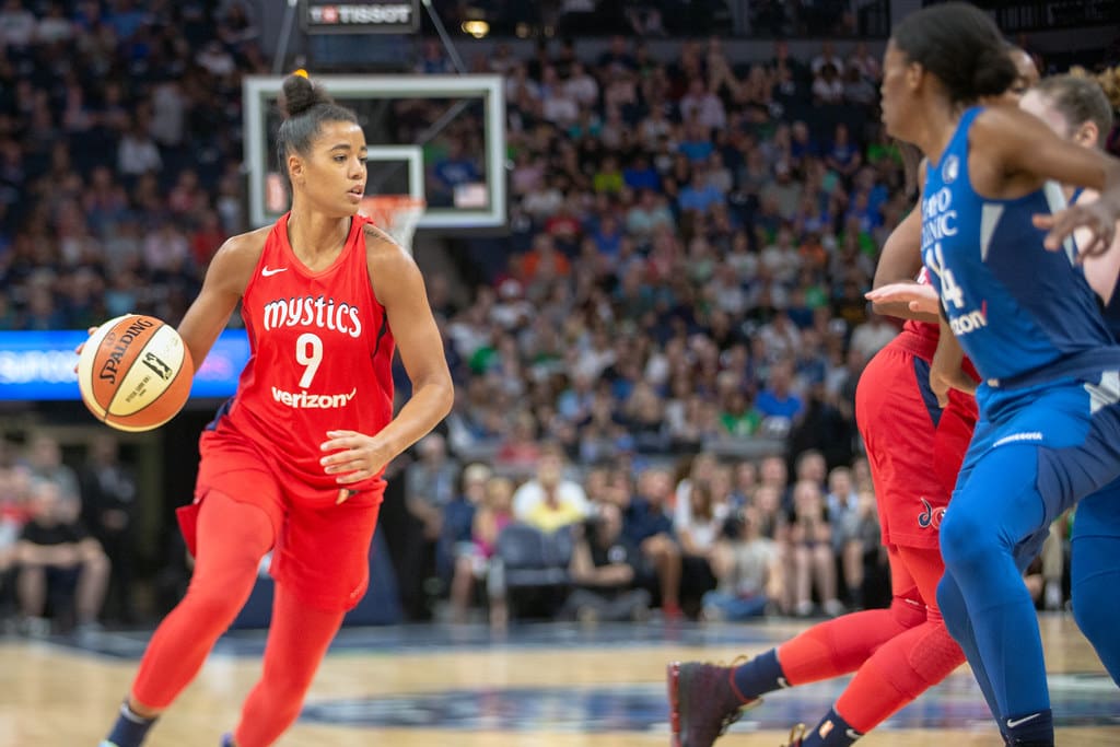
The Mystics’ logo is whimsical, with intricate fonts and flourishes that reflect the team’s name. While it’s unique and creative, the design might benefit from a sleeker, less ornate approach.
6. Seattle Storm

The Storm’s logo is dynamic and ties the team to the city with the lightning bolt against a silhouette of Seattle’s Space Needle. It’s also very sleek and clean, which makes it easy on the eyes.
5. Minnesota Lynx

The Lynx logo is fierce and detailed, with the wild cat’s head front and center. The icy blue and silver color scheme gives it a sleek, cool vibe, perfectly representing the team’s northern roots.
4. Chicago Sky

The Sky’s logo is clean and bright. Its modern feel makes it a standout and captures the essence of Chicago while staying true to the team’s name.
Read More: The 29 Most Successful NFL Seasons Ever
3. New York Liberty
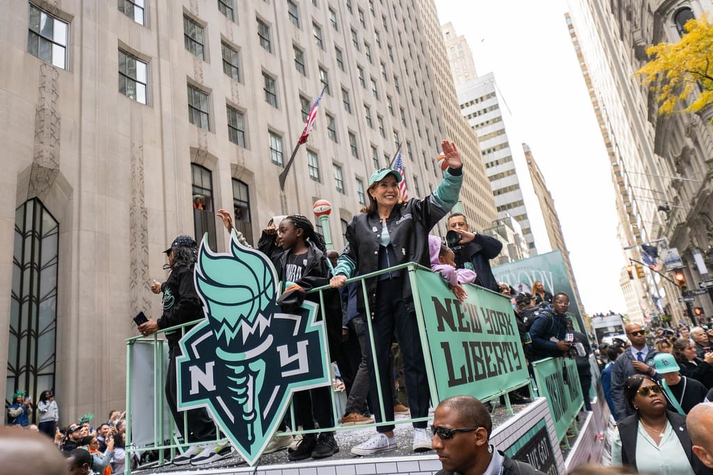
With the iconic torch front and center, the Liberty’s logo is full of symbolism, tying the franchise to its New York roots. Though the logo may feel slightly busy to some, it really encompasses the team spirit and energy of the city.
Read More: The Most Memorable Moments in WNBA History
2. Connecticut Sun
The Sun’s logo is bold, vibrant, and eye-catching, with a basketball at its core surrounded by radiating lines. The bright orange and red hues convey warmth and energy, making it one of the most distinctive designs in the league.
Read More: The 20 Greatest Moments in WNBA History
1. Las Vegas Aces
The Aces’ logo takes the top spot for its sleek, modern, and clean design. It embodies the team name without being overpowering or busy. Simply put, it’s the best of the best.
Read More: The 20 Highest-Paid Players in the WNBA